Power BI Tutorial: Create Your First Dashboard

If you're looking for a Power BI tutorial that takes you from a raw data file to a finished, published report, you're in the right place. Here’s what you’ll build by the end of this guide: we’ll then deploy it to the cloud and build an interactive dashboard, including querying it, setting alerts, configuring refresh schedules, and more.
Power BI is Microsoft's business intelligence platform, widely used by many organizations to turn spreadsheets and databases into interactive dashboards. Think of a sales team that needs to track revenue by region and month, or a manager who wants a single screen showing whether the team is hitting targets. That's what Power BI does, and you're about to build exactly that.
This tutorial walks you through the full workflow: loading data, cleaning it, building a proper data model, creating visuals, publishing to the cloud, and viewing the result on your phone. You'll use a practice semantic model (dataset) we provide, so you can follow along step by step. Plan for 2–3 hours to complete all three parts, or work through them one at a time.
At Dataquest, we teach data skills by building real projects. This tutorial follows the same approach and reflects the structure of our Power BI learning path. To go deeper into these concepts, explore Dataquest's Power BI learning path.
Table of Contents
- What You'll Build
- The Practice Semantic Model
- Part 1: Power BI Desktop
- Part 2: Power BI Service
- Part 3: Power BI Mobile App
- What to Learn Next
- FAQ
What You'll Build
Before we get into the steps, here's where you're headed.
You'll create a multi-page sales dashboard that includes KPI cards (total revenue, total orders, average order value), a monthly sales trend line chart, a regional sales bar chart, and a product performance matrix. You'll add slicers so anyone viewing the report can filter by date range or region.
Then you'll publish that report to the cloud through Power BI Service, pin key visuals to a dashboard for quick monitoring, and pull it up on your phone through the Power BI Mobile App. One semantic model. One report. Three platforms.
The Practice Semantic Model
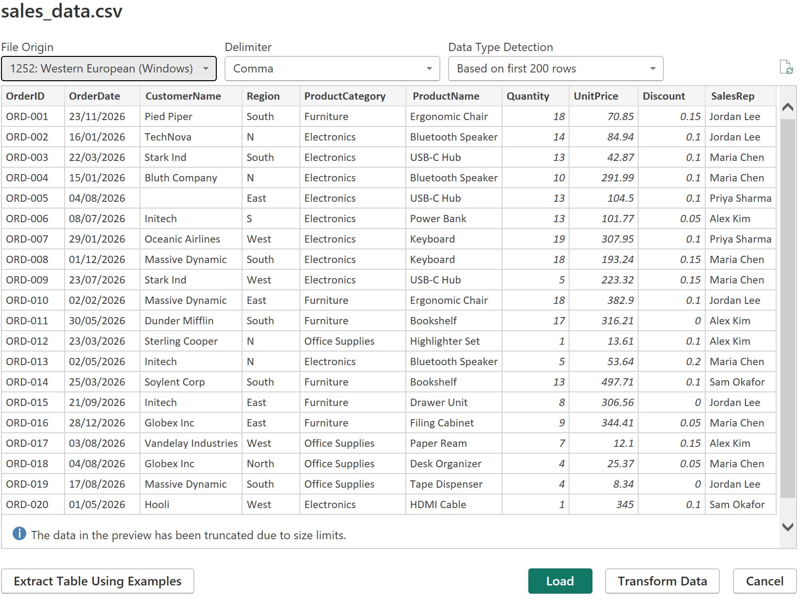
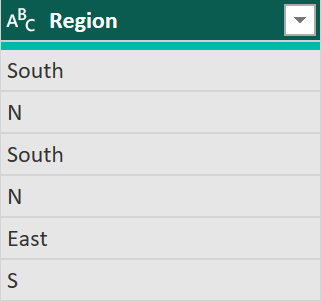
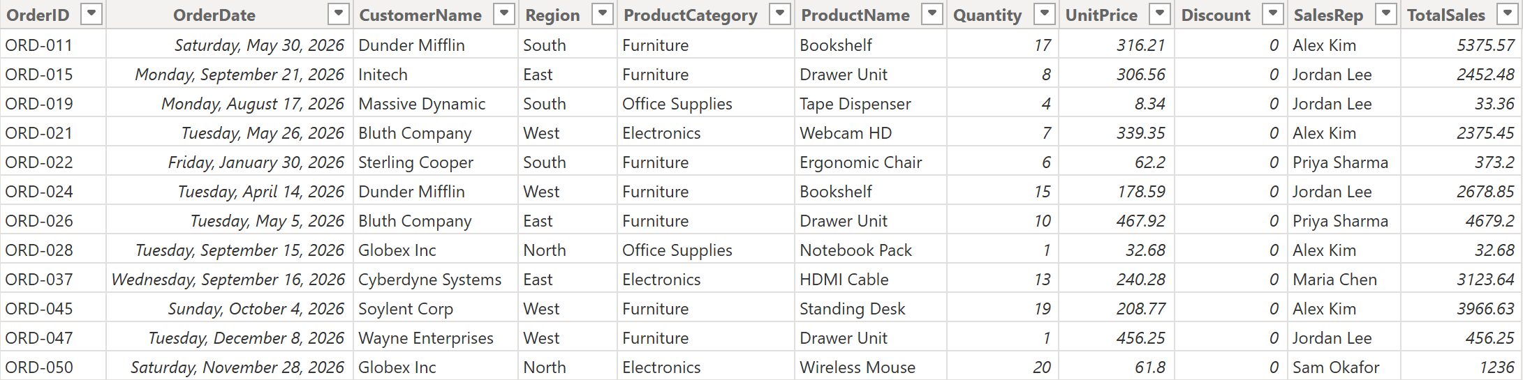
We'll work with a fictional sales semantic model containing about 500 rows of transactions. The data is intentionally messy; some region names are abbreviated, a few values are missing, and dates aren't consistently formatted. Real data looks like this, so it's good practice.
Here's a sample of the first 10 rows. The full 500-row semantic model is available for download here. Use it to follow along.
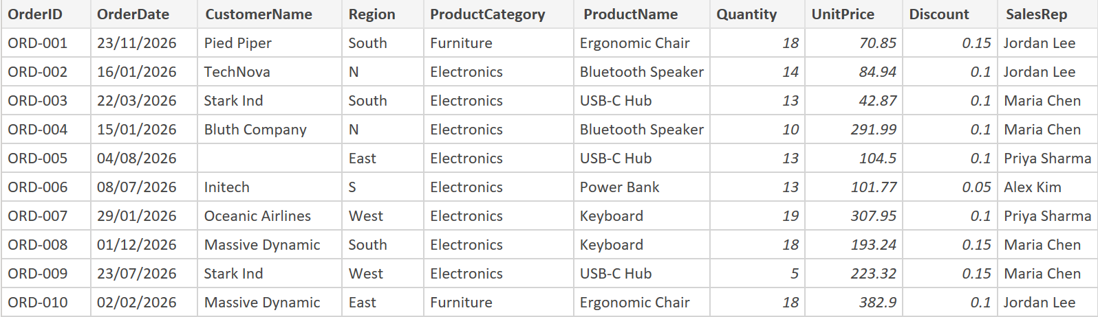
Notice the problems built into this data:ORD-002 and ORD-004 have "N" instead of "North", ORD-006 has “S" instead of "South", and ORD-005 is missing a CustomerName. You'll fix all of these in the Power Query section.
Part 1: Power BI Desktop
Power BI Desktop is the free Windows application where you'll spend most of your time. This is where data gets loaded, cleaned, modeled, and turned into visuals.
If you're on a Mac or Linux, see the FAQ(add_link) section for your options (browser-based Power BI Service, virtualization, or the mobile app).
Loading Data into Power BI
Start by downloading Power BI Desktop from Microsoft's website. It's free, no license required.
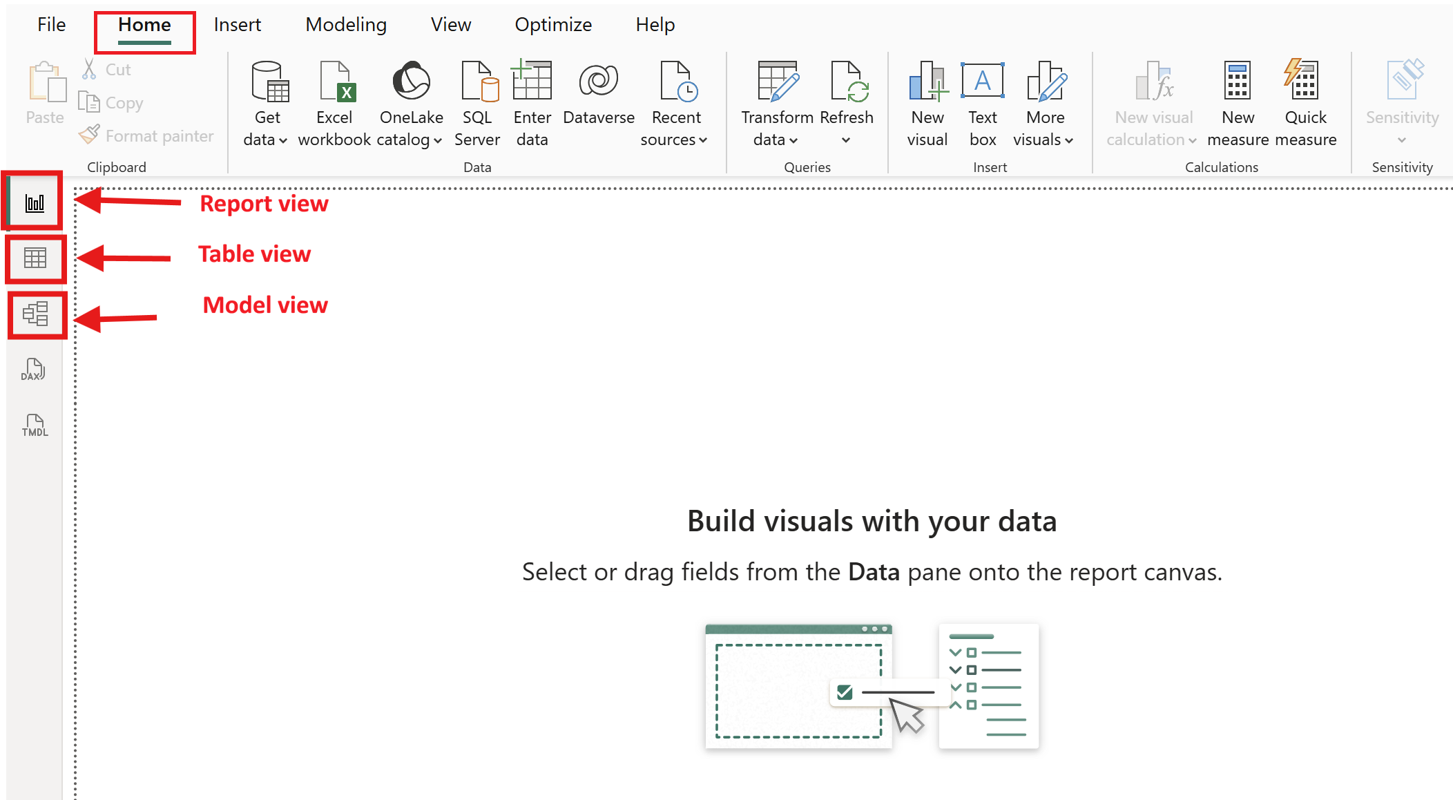
When you open the application, you'll see a blank canvas with three view icons on the left sidebar: Report view (where you build visuals), Table view (where you inspect your tables), and Model view (where you manage relationships between tables). You'll use all three during this tutorial.
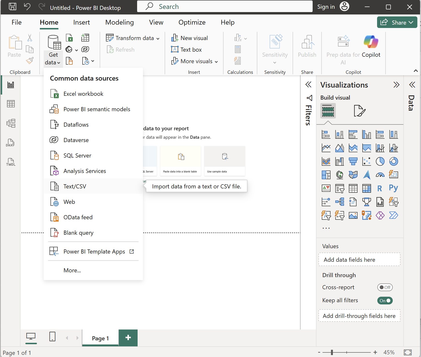
To load the practice semantic model, click Get Data on the Home ribbon, then select Text/CSV. Navigate to the sales_data.csv file you saved and click Open.
Power BI shows a preview of your data in the Navigator window, you should see the same columns and messy data from the sample above.
Power BI can connect to to many common data sources, including SQL databases, Excel files, web APIs, SharePoint lists, and more. We're using a CSV for simplicity, but the workflow is the same regardless of source: connect, preview, transform, load.
Cleaning and Transforming Data with Power Query
Power Query is the data transformation layer that sits between your raw data and your data model. Every change you make here is recorded as a step, and none of it alters your original CSV file. You can always go back, reorder steps, or delete them.
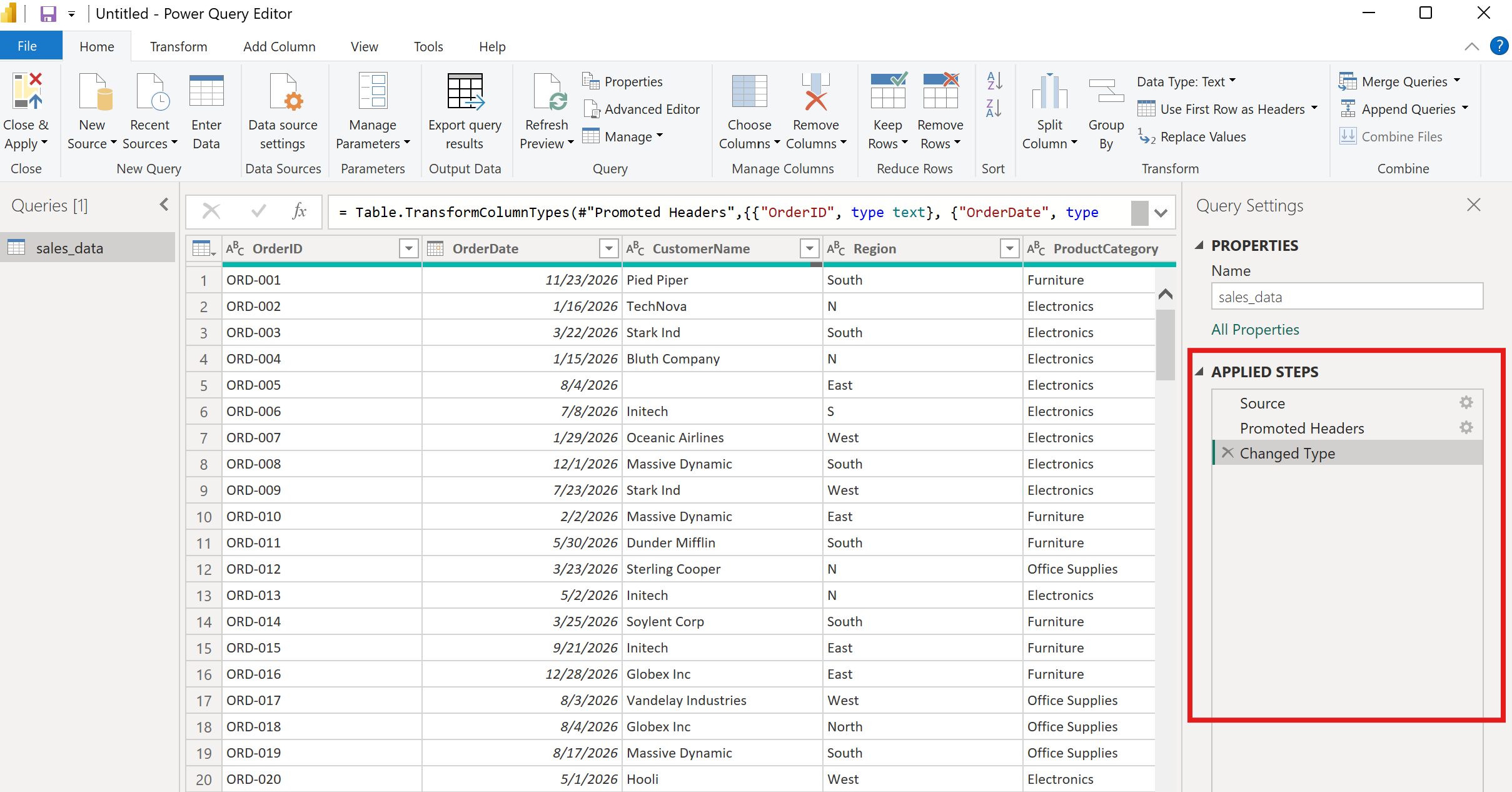
The Power Query Editor opens with your data previewed in the center. On the right, you'll see the Applied Steps pane, where every transformation you make is logged. At the top, the formula bar shows the underlying M code for the current step. You don't need to write M code for this tutorial, but knowing it's there helps if you want to customize later.
Here's what we'll clean, step by step.
Step 1: Check the headers
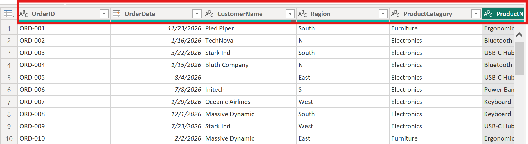
Your CSV's first row contains column names, so Power Query should promote them automatically. If you see "Column1, Column2..." instead of "OrderID, OrderDate...", go to the Home tab and click Use First Row as Headers.
Step 2: Set data types.
Power Query guesses data types, but it doesn't always get them right. Click the icon next to each column header to verify and set:
- OrderDate → Date
- Quantity → Whole Number
- UnitPrice → Decimal Number
- Discount → Decimal Number
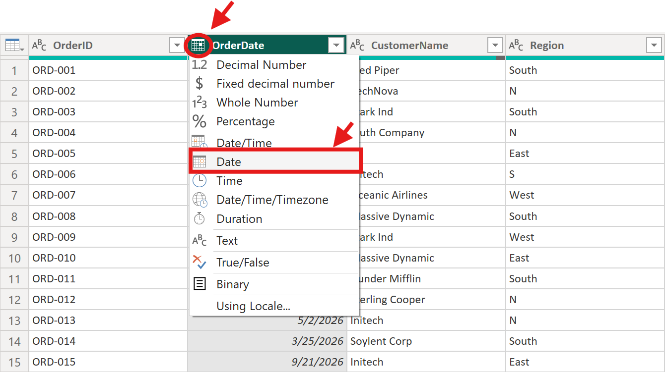
Getting data types right now prevents calculation errors later. A column typed as "Text" won't aggregate properly in your visuals, even if it contains numbers.
Step 3: Fix inconsistent region names
Look at the Region column, you'll see both "North" and "N", both "South" and "S".
Select the Region column, go to the Home tab, click Replace Values, and replace "N" with "North". Repeat this for "S" → "South", "E" → "East", and "W" → "West". Make sure you tick the box for “Match entire cell content”; otherwise, replacing "N" with "North" will also affect any values that already contain "N" (such as "North" itself), leading to incorrect results like "Northorth".
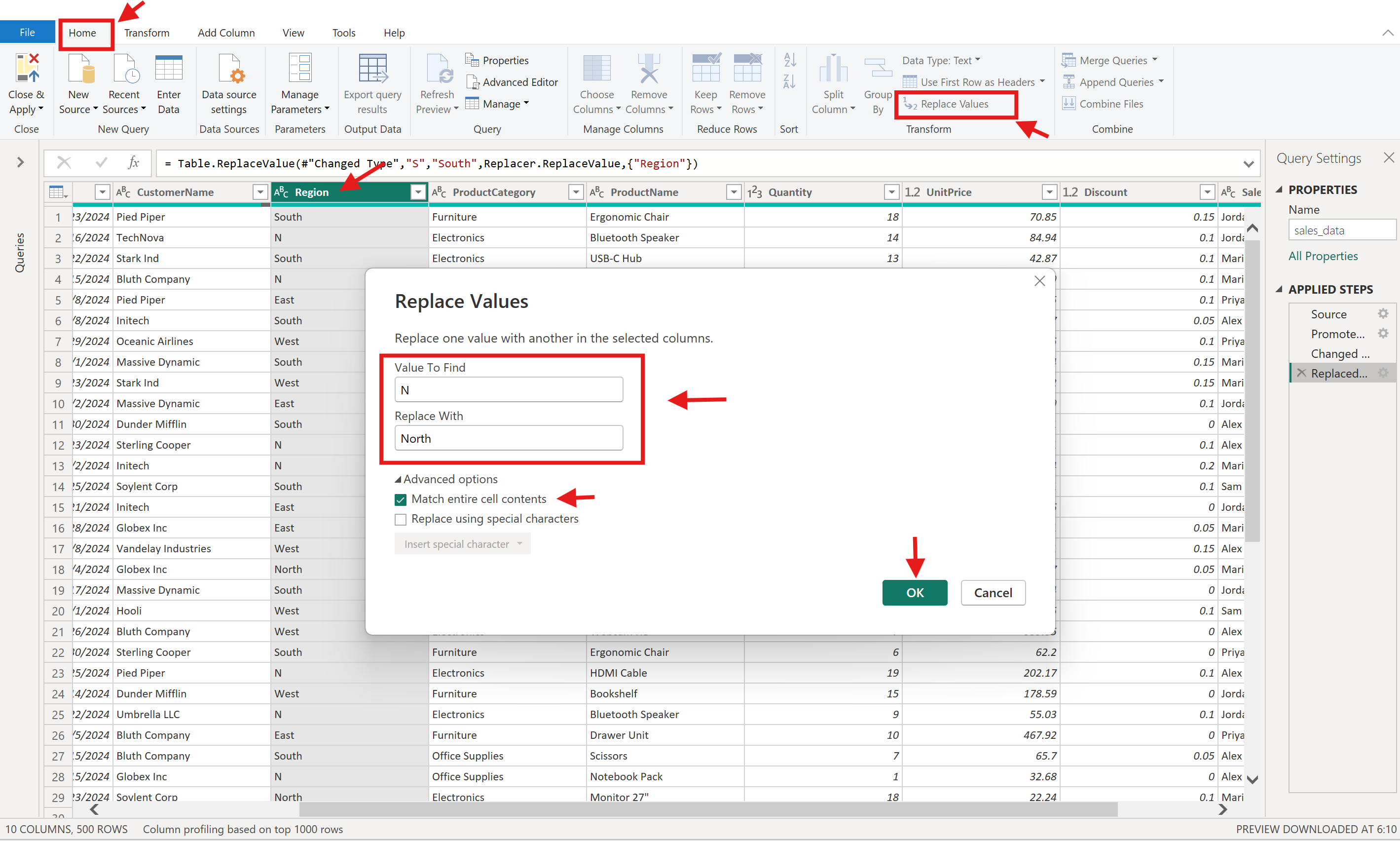
As an alternative, you can right-click a cell and select Replace Values to update it. This option is always available and can be useful for quick, targeted changes.
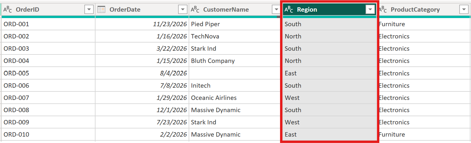
Here's what the Region column looks like after the update:
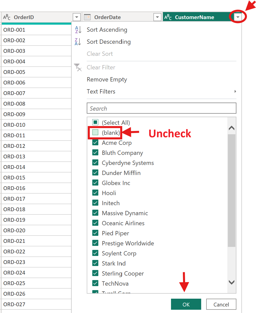
Step 4: Handle missing values
Click the dropdown arrow on the CustomerName column header and look for (null) entries. In our sample semantic model, ORD-005 is one of the rows with a missing customer name.
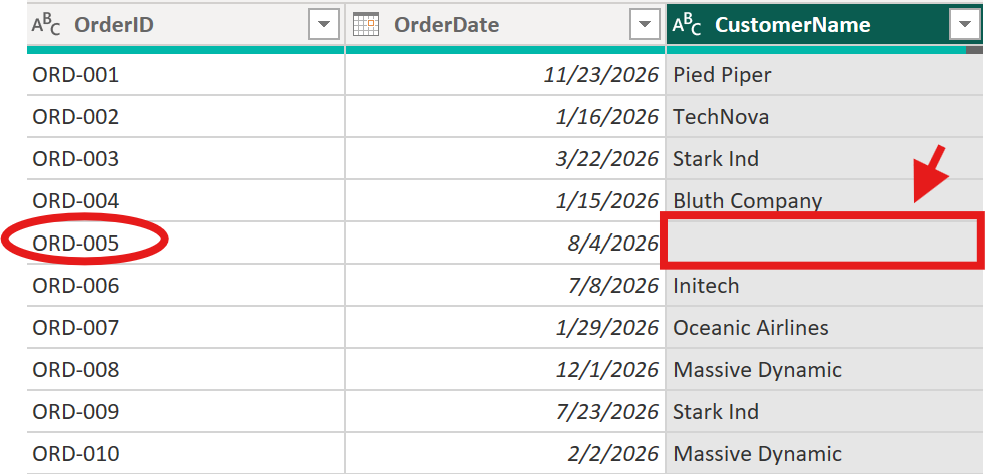
For this tutorial, open the CustomerName filter menu and uncheck (blank) to remove rows where the customer name is missing. In a real project, you'd decide column by column whether missing values matter for your analysis, since some null values may be acceptable while others require cleanup.
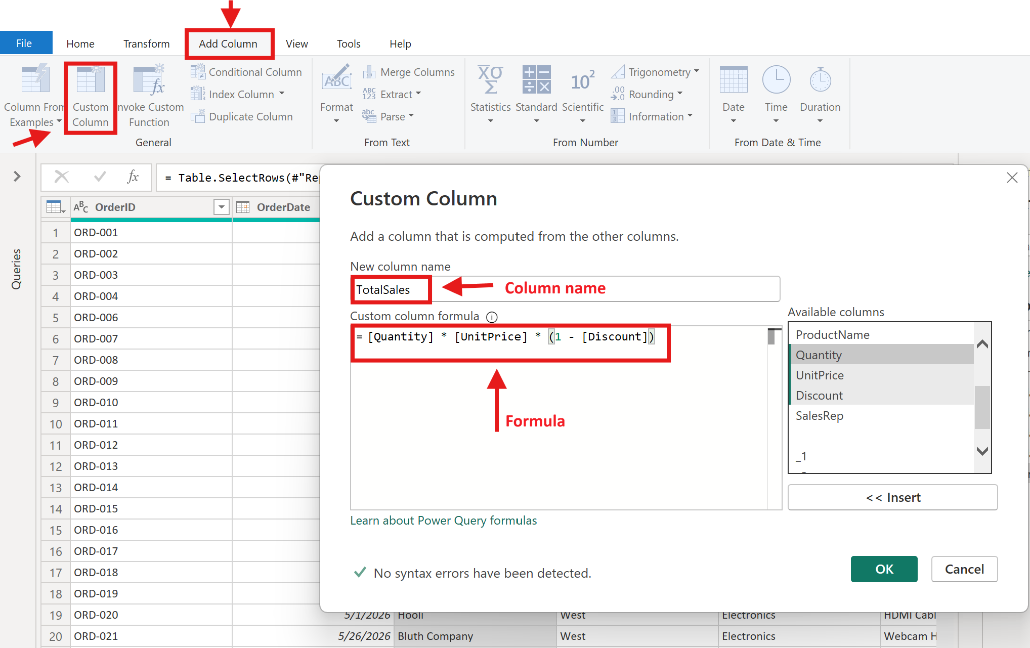
Step 5: Add a calculated column
We need a TotalSales column that accounts for quantity, price, and discount. Go to the Add Column tab, click Custom Column, and enter this formula:
[Quantity] * [UnitPrice] * (1 - [Discount])Name the column TotalSales and click OK.
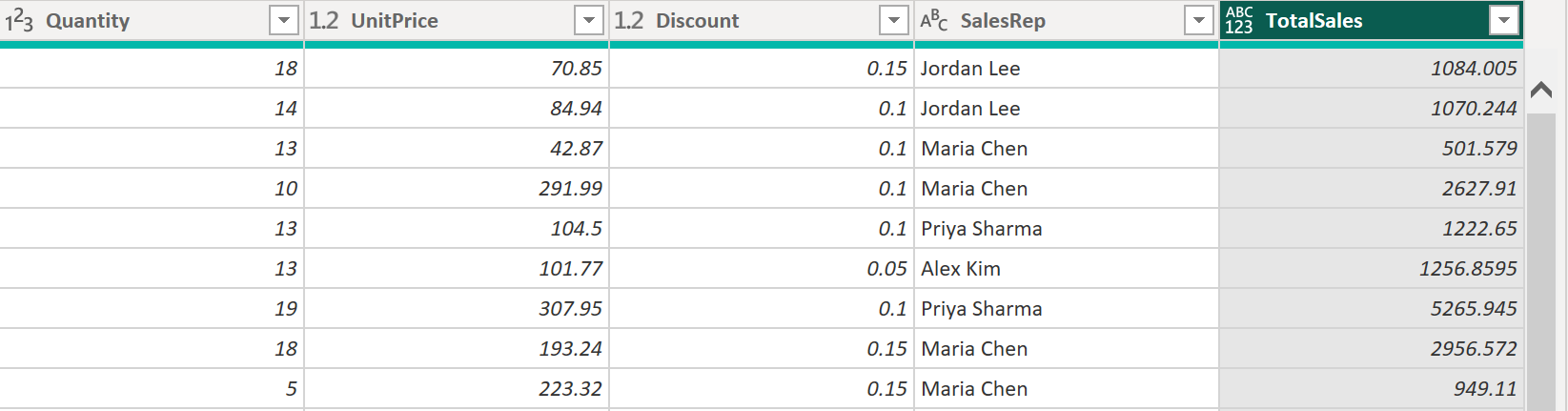
Here's what the calculation produces for our sample rows:
The data type for the newly created column (TotalSales) should be Decimal Number. Refer to Step 2 and change it accordingly.
Step 6: Understand unpivoting (a concept worth knowing)
Our semantic model doesn't need unpivoting, but this concept comes up often. Imagine a spreadsheet where each month is a separate column with sales values:
| Product | Jan | Feb | Mar |
|---|---|---|---|
| Mouse | 500 | 620 | 580 |
| Keyboard | 310 | 290 | 400 |
This "wide" format is fine for reading, but Power BI works better with "tall" data. Unpivoting converts it to:
| Product | Month | Sales |
|---|---|---|
| Mouse | Jan | 500 |
| Mouse | Feb | 620 |
| Mouse | Mar | 580 |
| Keyboard | Jan | 310 |
| Keyboard | Feb | 290 |
| Keyboard | Mar | 400 |
To unpivot in Power Query, select the month columns, right-click, and choose Unpivot Columns. You won't need it for this project, but file this away, it'll save you hours when you encounter spreadsheets designed for human reading rather than analysis.
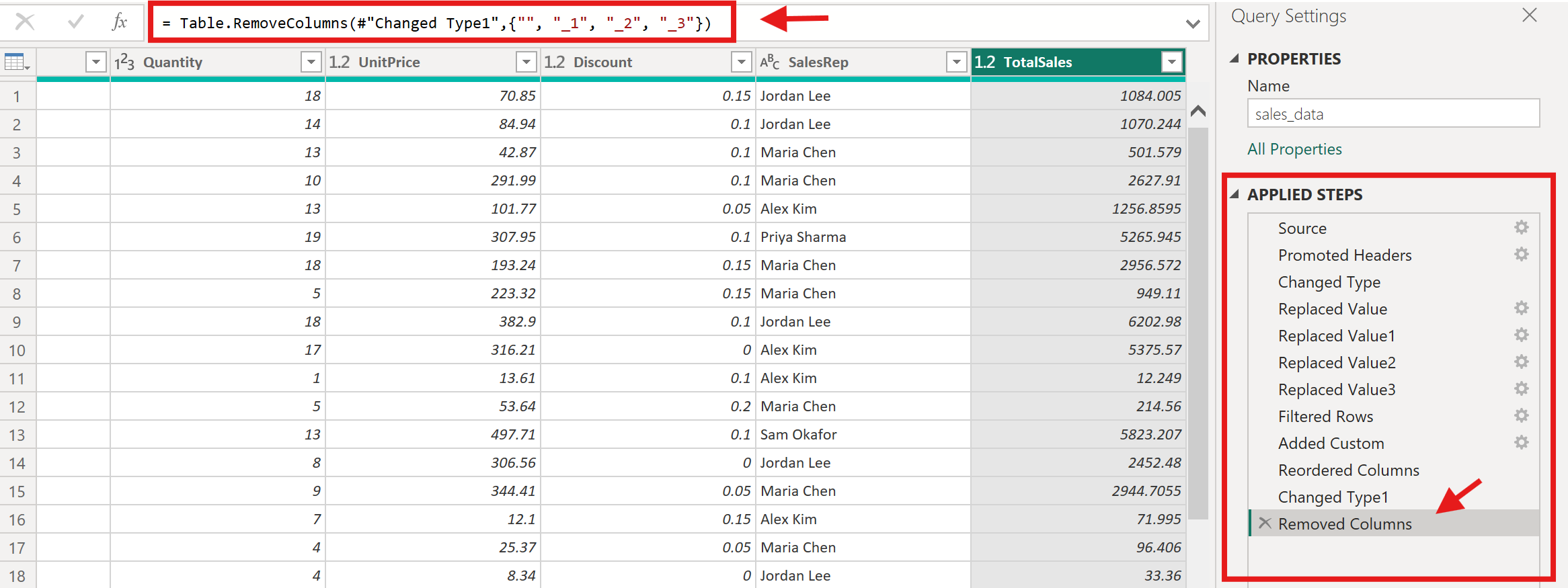
Every transformation you performed is recorded in the Applied Steps pane. You can click any step to see the data at that point, rename steps for clarity, or delete a step to undo it. This non-destructive approach means you can always trace and modify your logic.
For example, when you click the Added Custom step, the formula bar shows the Power Query formula used to create that step.
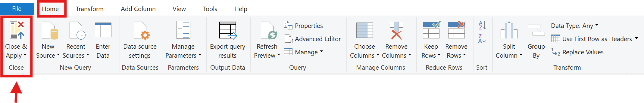
When you're satisfied with the cleaned data, click Close & Apply on the Home tab. Power Query loads the transformed data into your Power BI data model.
For a deeper look at data cleaning concepts, see Dataquest's Introduction to Data Analysis Using Microsoft Power BI.
Here's a reference for the most common Power Query transformations:
| Transformation | What It Does | When to Use It |
|---|---|---|
| Replace Values | Swaps one value for another | Fixing inconsistent entries, typos, abbreviations |
| Change Type | Sets the data type for a column | After loading — ensure dates, numbers, and text are typed correctly |
| Remove Rows | Deletes rows matching a condition | Removing blanks, errors, or irrelevant records |
| Add Column | Creates a new column from a formula | Calculated fields like TotalSales or FullName |
| Unpivot Columns | Converts columns into rows | When data is "wide" and needs to be "tall" for analysis |
| Group By | Aggregates rows by a grouping | Summarizing data before loading (use sparingly — DAX handles this better) |
Building a Data Model
A good data model makes everything easier, your visuals work correctly, your DAX calculations stay simple, and your report performs well. Rushing past this step is the most common reason people struggle with Power BI later.
Right now, after Power Query, you have one cleaned table. Every row is a transaction, and every column, OrderID, OrderDate, Region, ProductCategory, ProductName, Quantity, UnitPrice, Discount, TotalSales, SalesRep, lives in that single table. Here's what a few rows look like:
This works for quick analysis, but notice the problem: "South" appears in row after row. "Electronics" repeats hundreds of times. "Jordan Lee" shows up wherever Jordan made a sale. As your semantic model grows, all that repeated text bloats your file and makes DAX calculations harder to write.
The solution is to split this single table into a star schema, a structure where you separate what happened from the context around it.
Here's the idea. You'll take your current table and break it into two types:
- A fact table that keeps only the transaction data — the event itself. Each row stays as an order, but instead of storing "Ergonomic Chair" and "South" as text, it stores numeric keys (like ProductKey = 7, RegionKey = 2) that point to separate tables where those details live.
- Dimension tables that hold the descriptive context — a list of unique products, a list of unique regions, a table of dates. Each row in a dimension table appears only once.
| Fact Table (what you'll build) | Dimension Table (what you'll build) | |
|---|---|---|
| Contains | The transaction itself — what happened | The context — who, what, where, when |
| Rows | Many (one per order) | Few (one per unique product, region, or date) |
| Key columns | Foreign keys pointing to dimensions (ProductKey, RegionKey) | Primary key (unique identifier) |
| Numeric columns | Values you'll aggregate (Quantity, TotalSales) | Attributes you'll filter or group by (ProductCategory, Region) |
| Result | FactSales | DimProduct, DimRegion, DimDate |
You don't have these tables yet; you're about to build them. In a production environment, fact and dimension tables often come from separate database tables. For learning, we'll create the dimension tables from your current flat table using Power Query, then reshape the original into a proper fact table.
Building a DimProduct table:
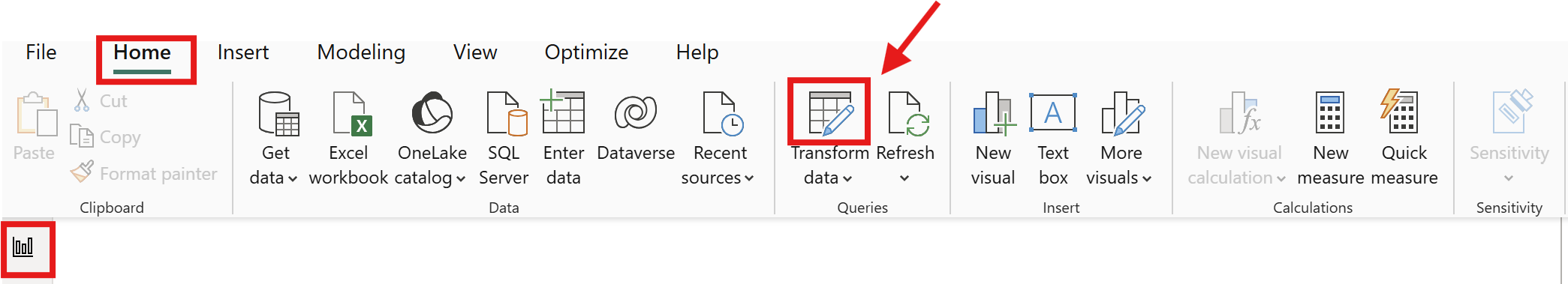
- In Power BI Desktop, go to the Home tab and click Transform Data to re-open Power Query Editor.
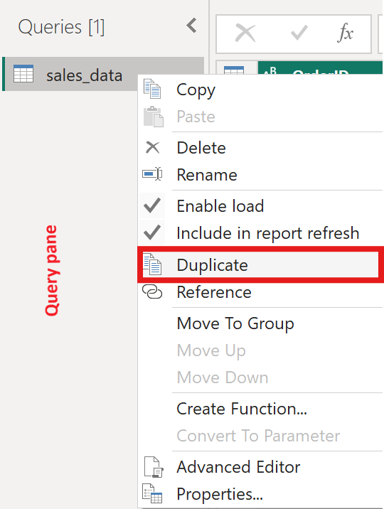
- Right-click your query(
sales_data) in the Queries pane and select Duplicate. Rename this copyDimProduct.
- Select only the
ProductCategoryandProductNamecolumns. Right-click and choose Remove Other Columns.
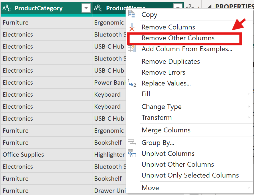
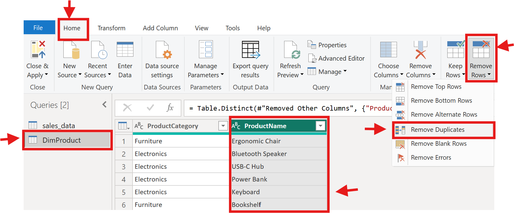
-
Go to the Home tab and click Remove Rows → Remove Duplicates.
Note: The Remove Duplicates feature requires you to select a column. In this case, select the ProductName column to remove duplicate values. In real projects though, duplicates should usually be removed across all columns that define the dimension.
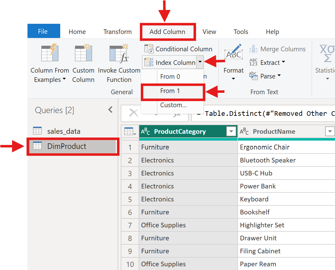
- Add an index column: go to Add Column → Index Column → From 1. Rename it
ProductKey.
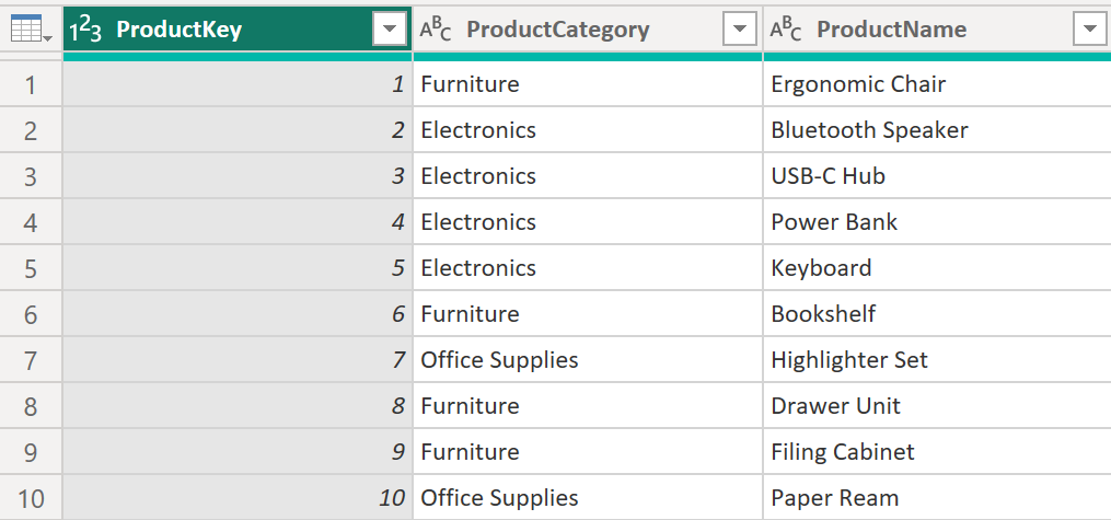
Your DimProduct table should now look similar to this example. The screenshot shows only a small sample of the rows.
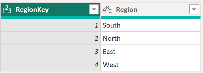
Building a DimRegion table:
Repeat the process: duplicate the original query(sales_data), keep only the Region column, remove duplicates, add an index column named RegionKey. You'll end up with four rows:
Creating a DimDate table:
Date tables are special. Power BI's time intelligence features (year-over-year comparisons, month-to-date calculations) require a dedicated date table with one row per day, covering the full range of your data.
Close Power Query for now (Close & Apply). Back in Power BI Desktop, go to the Modeling tab and click New Table.
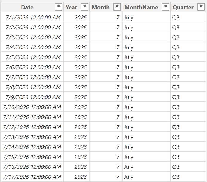
Enter this DAX formula:
DimDate =
ADDCOLUMNS(
    CALENDAR(DATE(2026, 1, 1), DATE(2026, 12, 31)),
    "Year", YEAR([Date]),
    "Month", MONTH([Date]),
    "MonthName", FORMAT([Date], "MMMM"),
    "Quarter", "Q" & FORMAT([Date], "Q")
)
This creates a table with 366 rows, one for every day in 2026, plus columns for Year, Month, MonthName, and Quarter. The first few rows look like this:
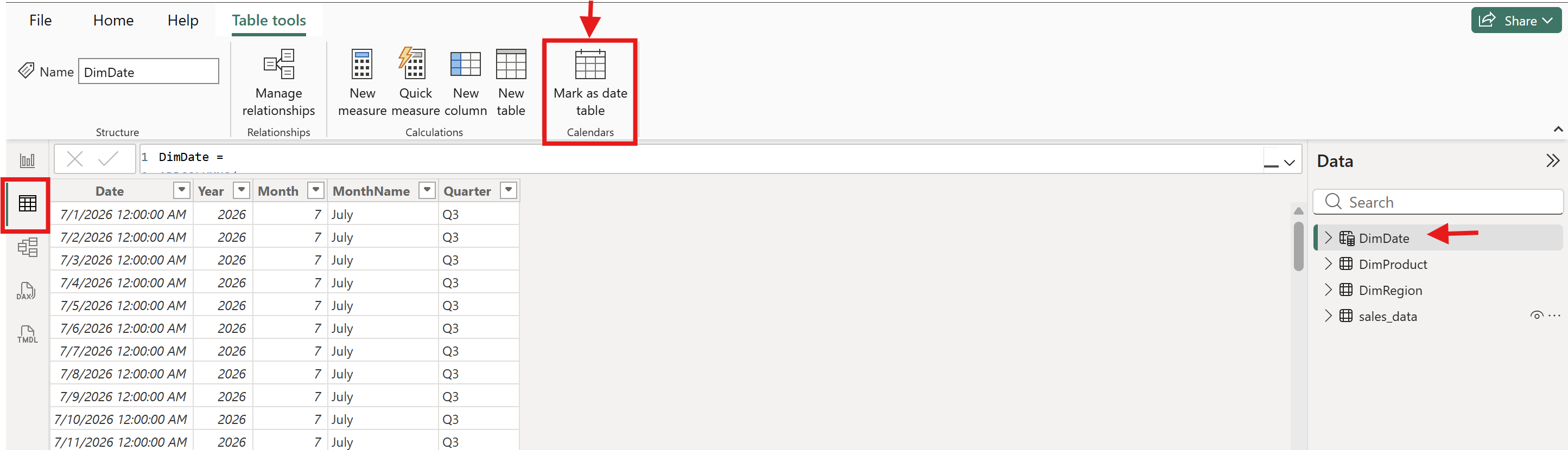
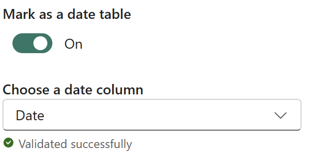
Mark it as a date table: select the DimDate table (from the Data pane in the top-right corner of Power BI Desktop), then go to the Table tools tab and click Mark as Date Table, choosing the Date column.
Connecting the foreign keys:
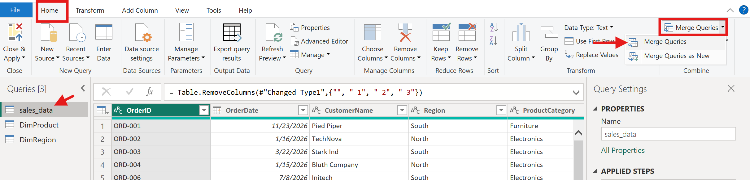
Go back to Power Query (Home → Transform Data) and add the matching keys to your sales_data table.
Use Merge Queries: select sales_data, click Home → Merge Queries:
Choose DimProduct as the second table, match on ProductCategory + ProductName:
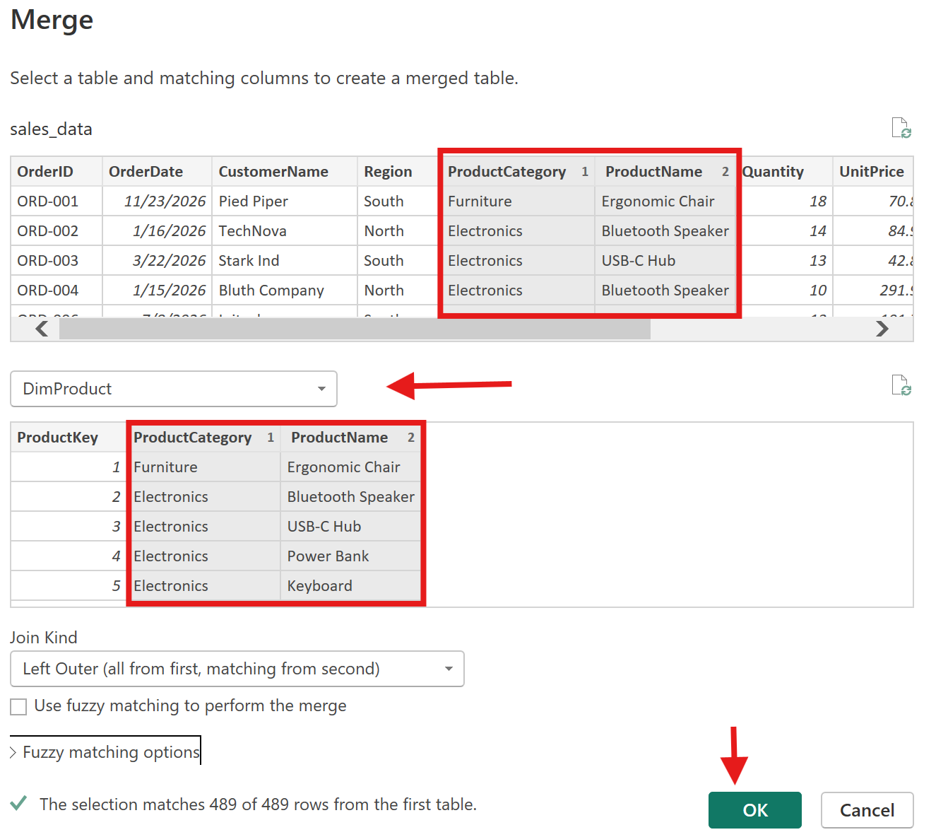
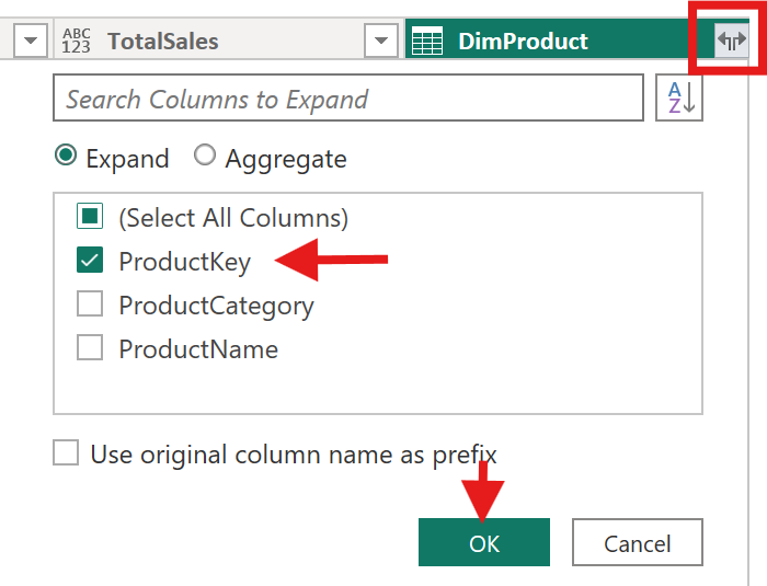
Expand the ProductKey column. You’ll see options like: ProductKey, ProductCategory, ProductName. Select ONLY ProductKey. Also, uncheck “Use original column names as prefix” to ensure Cleaner column names.
Repeat the merge for DimRegion using the Region column to bring in RegionKey. Exit Power Query by clicking Close and Apply.
For dates, you'll relate sales_data[OrderDate] directly to DimDate[Date], no merge needed.
Creating relationships:
Switch to Model view using the left sidebar icon. You'll see your tables as boxes. Drag sales_data[ProductKey] to DimProduct[ProductKey] to create a relationship. Repeat for RegionKey and sales_data[OrderDate] → DimDate[Date]. Each relationship should be one-to-many (”one” side on the dimension, “many” side on the fact table), with a single cross-filter direction.
Note: Sometimes Power BI automatically creates relationships between tables when columns share the same name. If you notice existing auto-created connections, delete them first before manually creating the correct relationships by dragging the fields directly in Model view. This helps ensure the relationships use the intended columns and settings, and automatically becomes active.
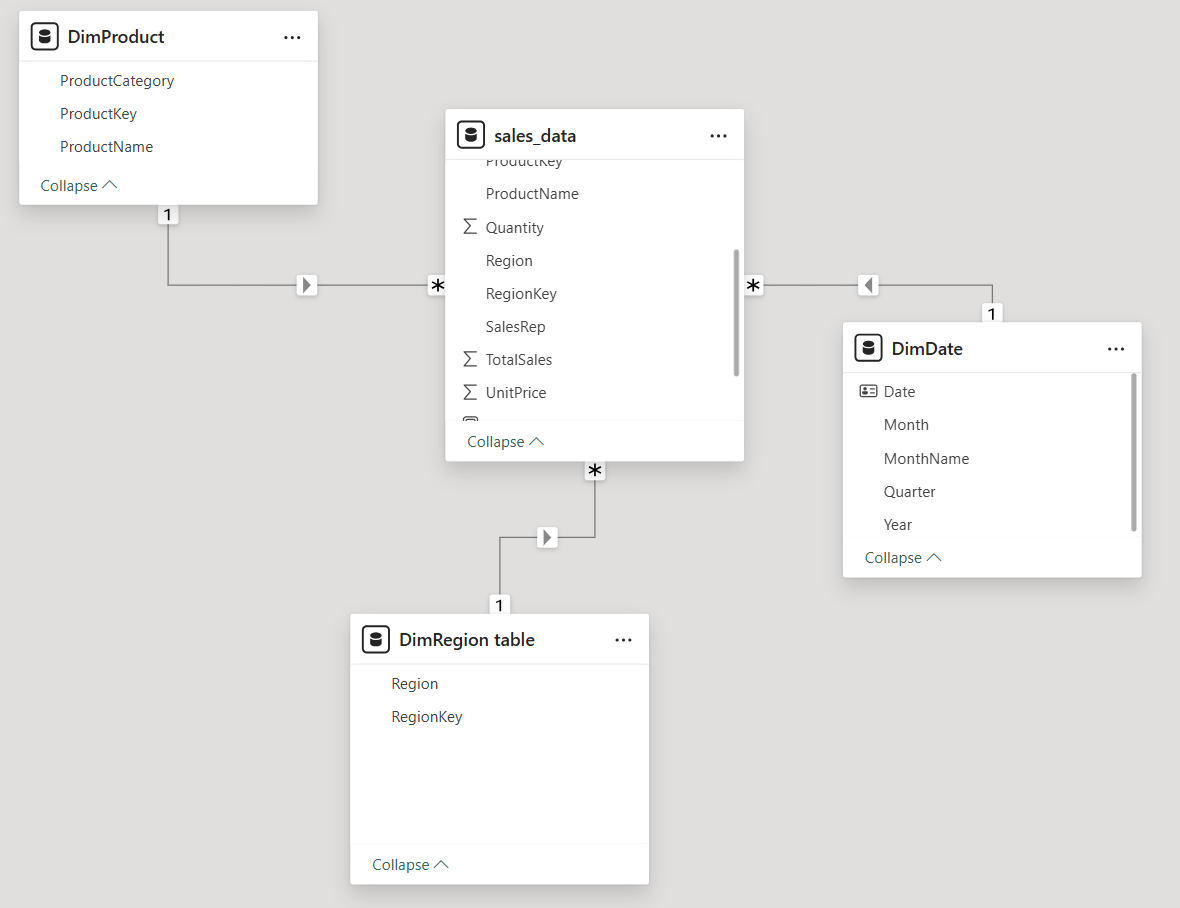
Make sure the connections are active. A dotted relationship line usually means the relationship is inactive. For this tutorial, each relationship should be active, one-to-many, and single-direction from the dimension table to sales_data.
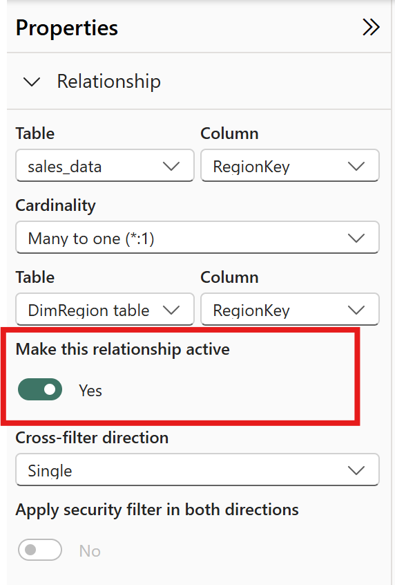
Otherwise,double-click the dotted relationship line, then under Properties, check the following:
Your star schema is complete. The fact table (sales_data) holds the transactions. The dimension tables provide the context. When you build a visual and drag Region onto a chart, Power BI filters the fact table through the DimRegion relationship automatically. That's why modeling matters, it defines how your data behaves in every visual you create.
A note on learning: building dimension tables from a flat file is a training exercise. In practice, your data source usually provides separate tables, and your modeling work focuses on connecting them correctly. The skill you're building here, understanding why a star schema exists and how relationships work, transfers directly to real projects.
For a deeper understanding of data modeling, the Learn Data Modeling in Power BI course by Dataquest covers these concepts in detail.
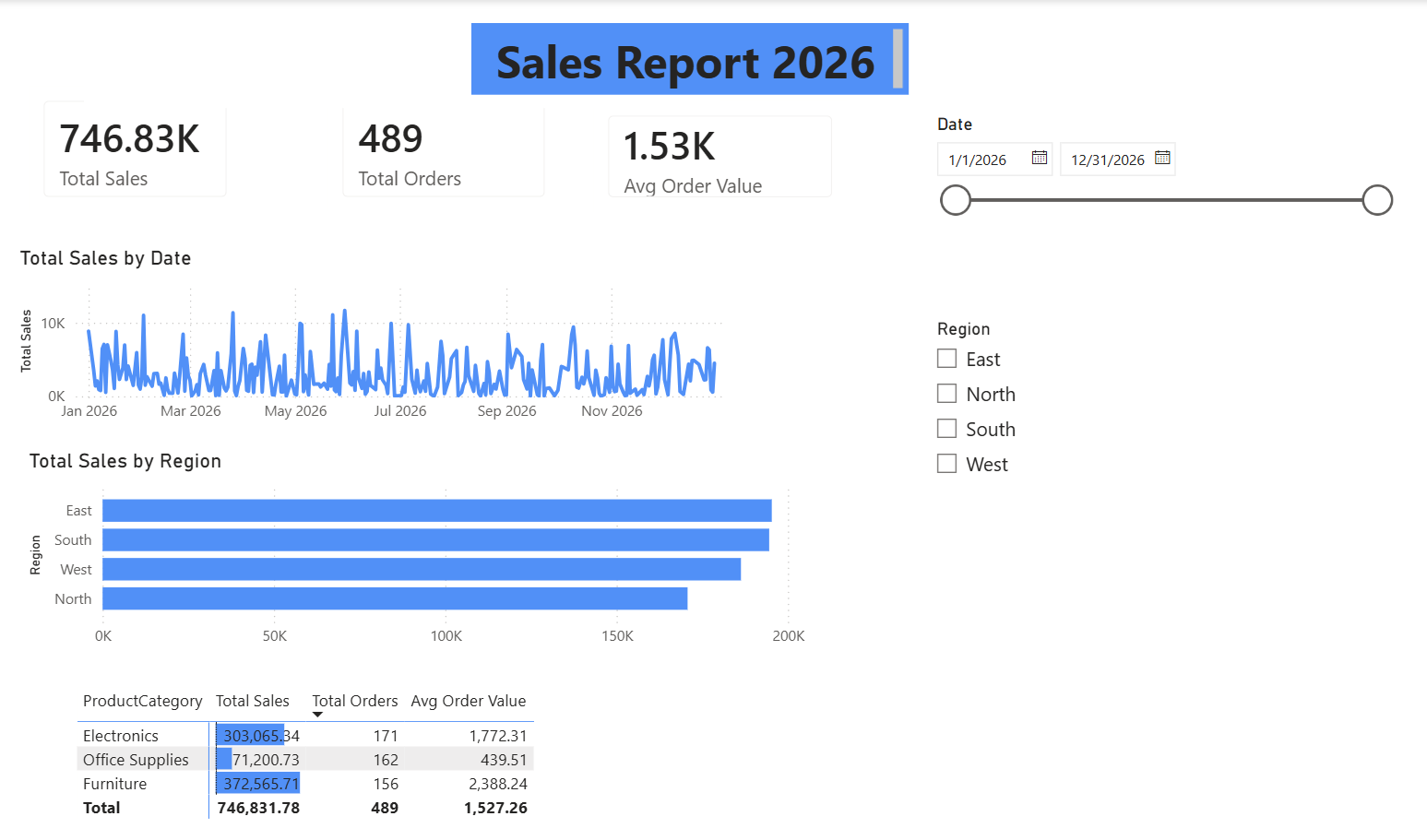
Creating Visuals: Charts, Tables, and KPIs
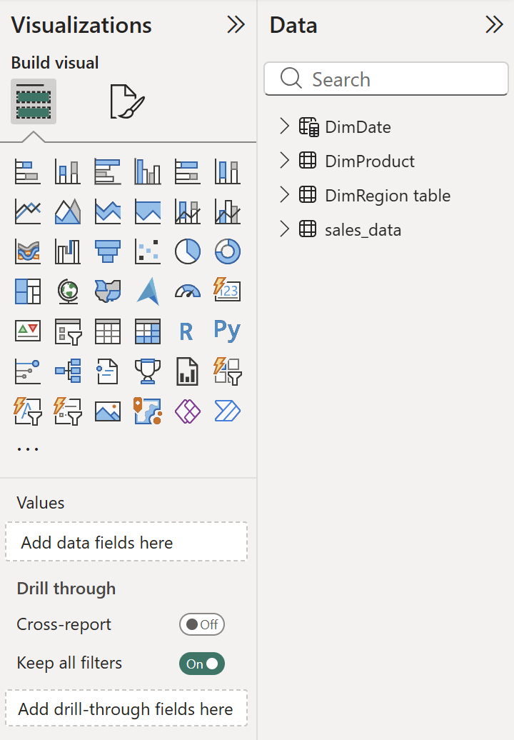
Switch back to Report view. This is where your data model becomes something people can see and interact with.

On the right side of the screen, you'll see two key panes: Visualizations (where you pick chart types) and Data (where your tables and fields appear). The workflow is consistent: select a chart type, drag fields into the appropriate wells (axis, values, legend), and format.
We'll build five visuals. Each one introduces a concept you'll reuse.
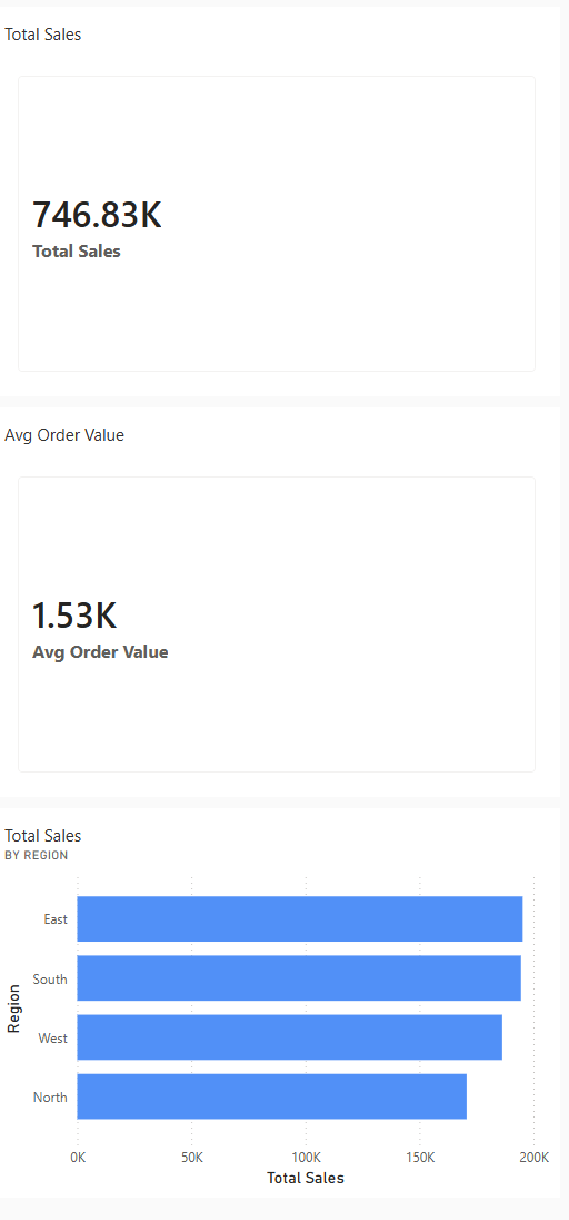
KPI Cards: Your First DAX Measures

KPI cards display single numbers, total revenue, total orders, average order value. To show these, you need measures: calculations that aggregate data on the fly based on the current filter context.
Here's the difference between a measure and a calculated column. A calculated column adds a value to every row in your table, it's computed once and stored (like our TotalSales column from Power Query). A measure doesn't store anything. It calculates in real time based on whatever filters are active. When someone selects "North" in a slicer, measures recalculate for the North region only.
Create your first measure. In the Data pane, right-click the s**ales_data** table and select New Measure.
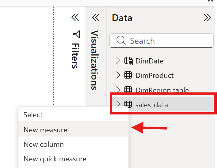
Enter the formula below:
Total Sales = SUM(sales_data[TotalSales])This sums the TotalSales column across all rows that match the current filter context. Now create two more:
Total Orders = COUNTROWS(sales_data)Avg Order Value = DIVIDE([Total Sales], [Total Orders])- DIVIDE is safer than using the
/operator because it returns a blank instead of an error when dividing by zero. That prevents broken visuals when a filter combination returns no data.

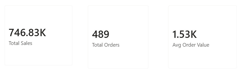
Now add three Card visuals to your report canvas. Click the Card icon in the Visualizations pane,
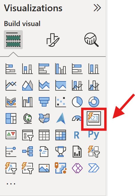
then drag your Total Sales measure into the Fields well.
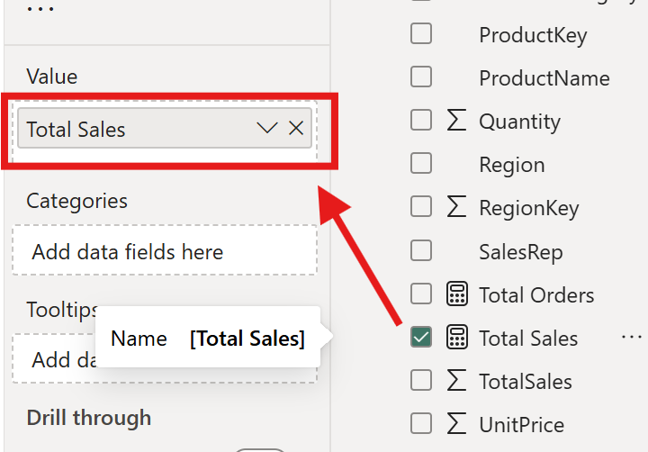
Repeat for Total Orders and Avg Order Value. You'll see the numbers appear instantly.
Line Chart: Monthly Sales Trend

Select the Line Chart visual from the Visualizations pane. Drag DimDate[Date] to the X-axis and Total Sales (measure) to the Y-axis. Power BI automatically creates a date hierarchy (Year → Quarter → Month → Day). Click the drill-down arrows at the top of the chart to move between levels, or expand to the Month level for a clean monthly trend.
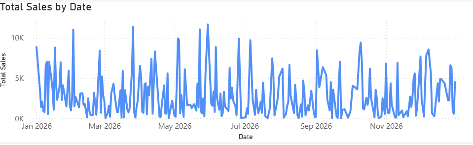
This chart answers "how are sales trending over time?" at a glance. When you add slicers later, this chart will update dynamically — select a specific region and the trend recalculates for that region only.
Bar Chart: Sales by Region

Select the Clustered Bar Chart visual. Drag DimRegion[Region] to the Y-axis and Total Sales to the X-axis. Now you can see which region drives the most revenue.
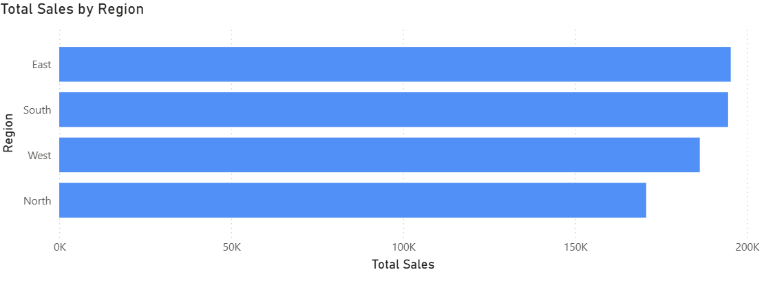
You can also enable data labels by clicking the Format pane (paint roller icon) and toggling on Data labels.
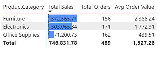
Matrix: Product Performance
![]()
The Matrix visual is Power BI's version of a pivot table. Select the Matrix icon, then drag DimProduct[ProductCategory] to Rows, and add three measures to Values: Total Sales, Total Orders, Avg Order Value.
To add conditional formatting, select the Matrix visual, then go to the Values section in the Visualizations pane and click the dropdown arrow next to Total Sales. From there, choose Conditional formatting → Data bars.
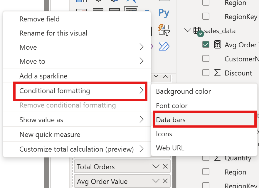
This will add in-cell bar charts to the Total Sales column, making it much easier to compare categories at a glance.
Slicers: Making the Report Interactive

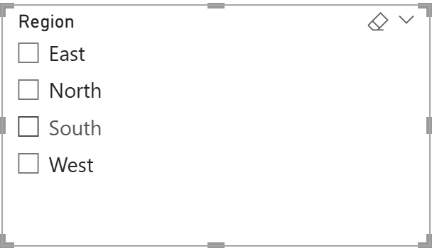
Slicers let report viewers filter data without editing anything. Add a Slicer visual and drag DimDate[Date] into it — this creates a date range slider.

Add a second slicer with DimRegion[Region] — this creates a list of checkboxes.
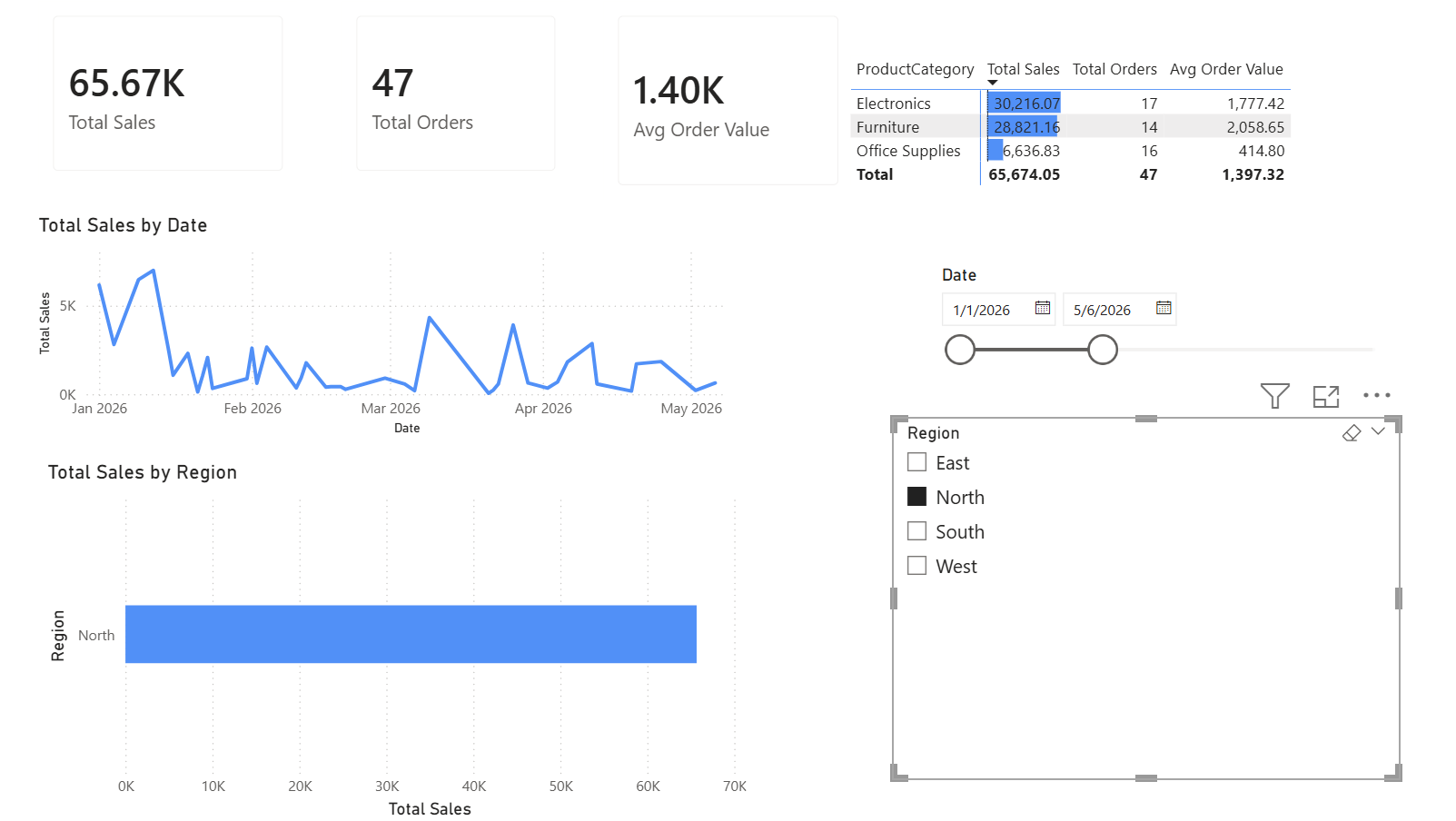
Now try it: select "North" in the region slicer. Every visual on the page updates to show only North region data. Your KPI cards recalculate, the trend chart filters, the bar chart highlights, and the matrix re-aggregates. This cross-filtering is one of Power BI's most useful features, and it works because your data model has proper relationships.
Three measures, five visuals, and two slicers — that's a fully interactive report. Every visual responds to the slicers, and every number recalculates based on the filters your viewer selects. That interactivity comes from the combination of a well-built data model and measures that calculate in context.
For guidance on choosing the right chart type for your data, see Dataquest's data visualization best practices guide.
Putting It All Together: Your Report Layout
You have five visuals and two slicers. Now arrange them into a layout that's easy to scan.
Place the three KPI cards across the top of the canvas, they provide the summary at a glance. Position the line chart below the KPIs, spanning the full width. Put the bar chart and matrix side by side beneath the line chart. Tuck the slicers into the left sidebar or top of the page where they're accessible but don't crowd the visuals.
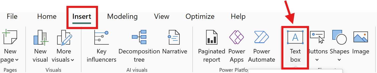
Add a title using the Text Box tool on the Insert tab. Something straightforward: "Sales Report 2026".
Keep formatting consistent, use one accent color for chart highlights and keep labels readable.
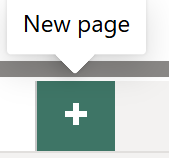
To create a second report page, click the + icon at the bottom of the canvas.
You might use this for a detailed product breakdown or a table showing individual transactions. Multiple pages keep your report organized without cramming everything onto one view.
Save your file: File → Save As and choose a location. Your file saves as a .pbix file, the native Power BI Desktop format.

Part 2: Power BI Service
Power BI Desktop is where you build. Power BI Service is where you share, collaborate, and monitor. It's a browser-based platform at app.powerbi.com where published reports live in the cloud.
Publishing Your Report
From Power BI Desktop, click Publish on the Home ribbon. You'll be prompted to sign in with a Microsoft account. If you don't have one, you can create a free account, Power BI offers a free tier for personal use.
Select My Workspace as the destination and click Select. Power BI uploads your report and its underlying semantic model to the cloud. When it finishes, you'll see a link to open the report in Power BI Service.

A quick note on licensing: Power BI Desktop is free for everyone. In general, the free tier of Power BI Service lets you publish to your personal workspace and view your own reports. To share reports with other people, you and your recipients typically need Power BI Pro or Premium Per User licenses. Organizations with Microsoft 365 E5 subscriptions may already include Pro licenses, so it’s worth checking before purchasing separately. For the latest licensing details and pricing, refer to Microsoft’s official Power BI pricing page.
Navigating Workspaces
When you open Power BI Service, the left navigation shows My Workspace, your personal area where published reports and semantic models land by default.
For team collaboration, you can create shared workspaces. These are shared spaces where multiple people can access the same reports, semantic model, and dashboards. You control who has access and what role they play (Admin, Member, Contributor, Viewer).
Workspaces now operate within the broader Microsoft Fabric ecosystem. For this tutorial, you don't need to worry about Fabric, just know that workspaces are the organizational building block and they'll carry over if your organization adopts Fabric later.
Creating a Dashboard from Your Report
This is a distinction worth understanding clearly: in Power BI Service, a report and a dashboard are different things.
Your report is what you built in Desktop, a multi-page, interactive document with slicers and drill-through capabilities. A dashboard is a single-page collection of "pinned" tiles from one or more reports. Think of a dashboard as a monitoring screen: you see key numbers at a glance, and clicking a tile opens the source report for details.
| Feature | Report | Dashboard |
|---|---|---|
| Pages | Multiple | Single |
| Interactivity | Slicers, filters, drill-through | Click a tile to open source report |
| Created in | Power BI Desktop or Service | Power BI Service only |
| Editing | Full editing of visuals | Pin or unpin tiles |
| Best for | Detailed analysis and exploration | Quick monitoring and overview |
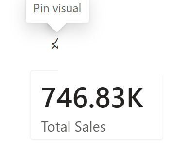
To create a dashboard, open your report in Power BI Service. Hover over any visual, a pin icon appears in the top-right corner. Click it, name your new dashboard (or select an existing one), and click Pin. Repeat for the visuals you want on your monitoring screen: the three KPI cards, the trend line chart, and the regional bar chart make a good starting set.

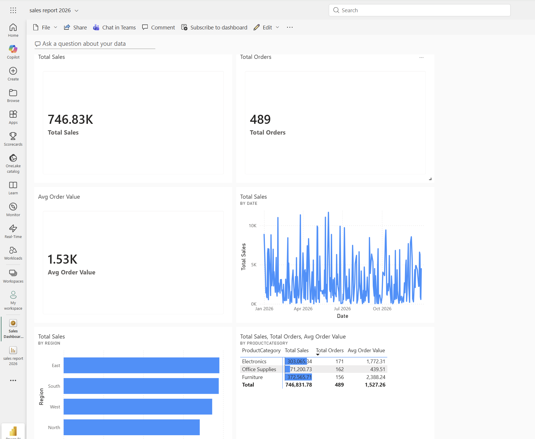
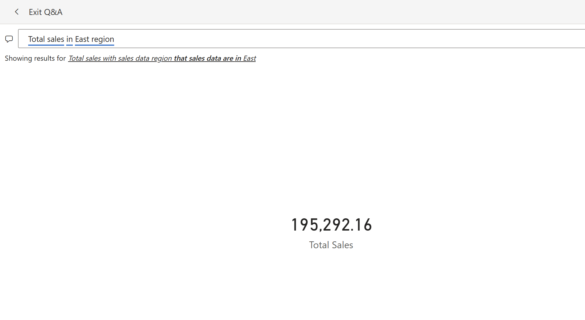
Dashboards also support Q&A, a natural language feature. If Q&A is enabled, you may see a text box that says "Ask a question about your data." Type something like "total sales in East region" and Power BI generates a visual answer on the fly.

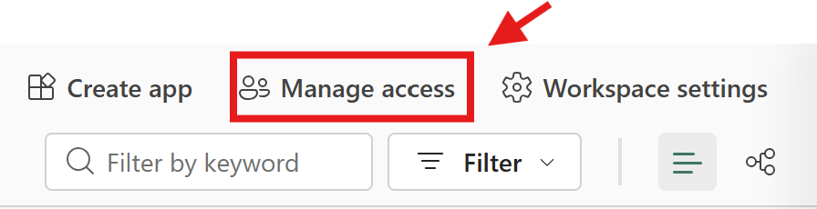
Sharing and Permissions
You have several ways to share your work with others.
The most common approach is workspace access (only available for shared workspaces). Add people to your shared workspace and assign them a role: Viewer (can see reports and dashboards), Contributor (can edit), Member (can publish), or Admin (full control).
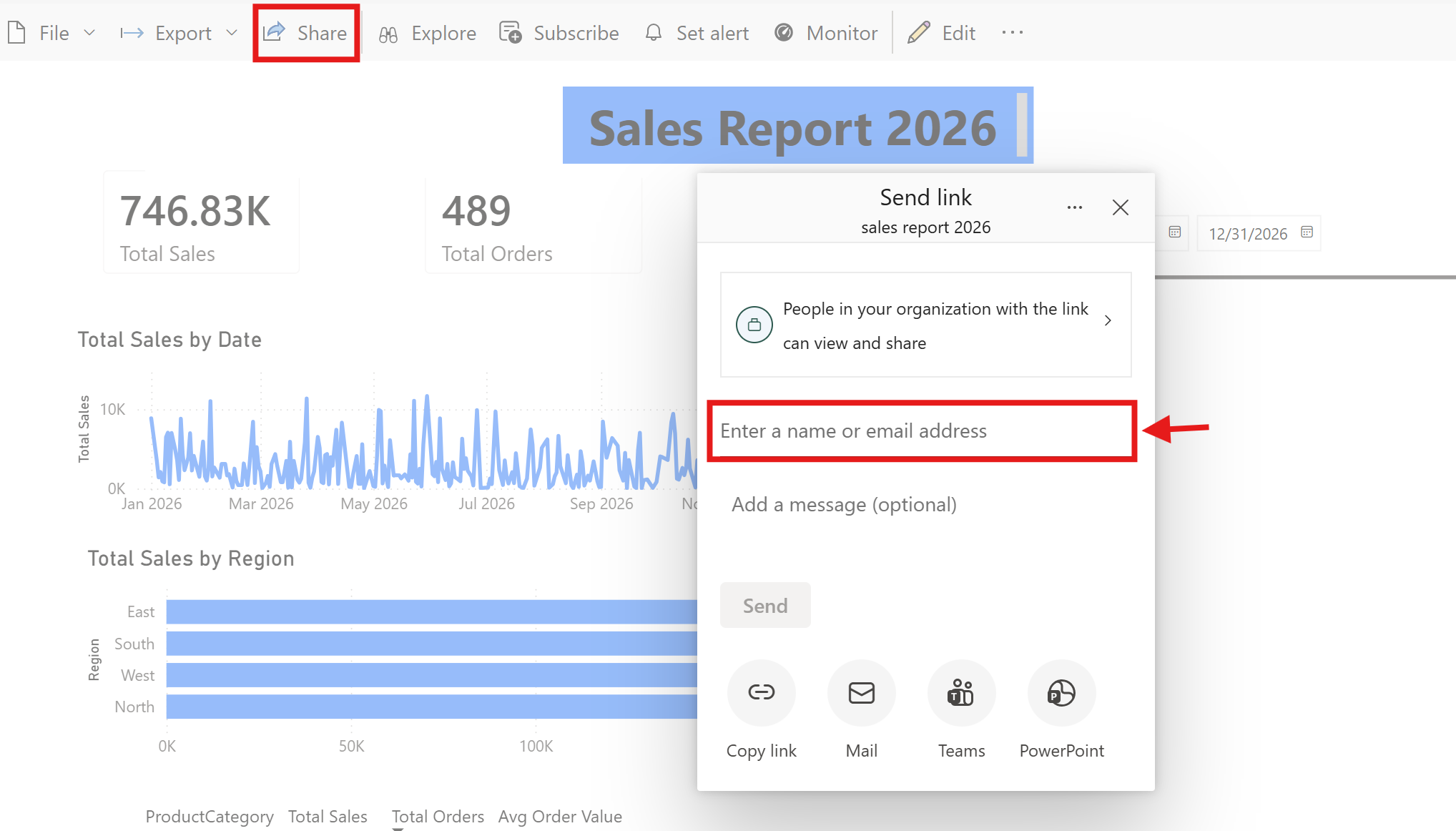
You can also share a direct link to a specific report/dashboard by clicking the Share button and entering email addresses. In general, recipients need a Pro or PPU license to view shared content, unless the content is hosted on a Premium or Fabric capacity, in which case free users can view it.
For broader distribution, Power BI supports embedding reports in Microsoft Teams channels and SharePoint pages. This puts dashboards where people already work, rather than asking them to visit a separate tool.
Row-Level Security (RLS) is worth knowing about, even though we won't configure it here. RLS lets you define rules so that different users see different data. A regional manager for East would only see East region data, even though the underlying semantic model contains all regions. You define these roles in Power BI Desktop and assign users to them in the Service.
Scheduled Data Refresh
When you publish a report, the data in Power BI Service is a snapshot from the last time you refreshed in Desktop. It doesn't update automatically unless you configure it.

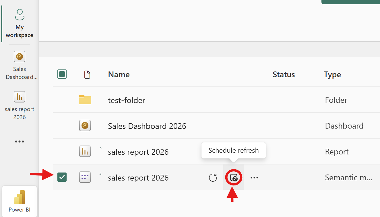
To set up scheduled refresh, go to your workspace in Power BI Service, click the three dots next to your semantic model, and select Scheduled Refresh. You can set it to refresh daily, weekly, or at specific intervals — up to 8 times per day on a Pro license.
For file-based data sources like our CSV, the file needs to be in a location Power BI Service can reach — typically OneDrive for Business or SharePoint. If your data lives in an on-premises database or a file on your company network, you'll need a data gateway, a small application that bridges your local network and the cloud. Microsoft provides both a personal gateway (for one user) and an enterprise gateway (for teams).
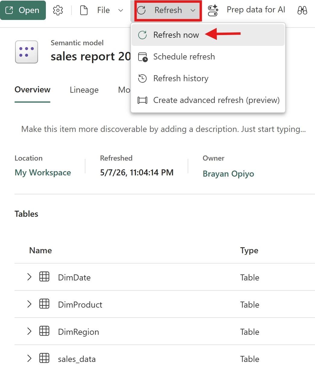
For learning purposes, manual refresh works fine. Open your semantic model in Power BI Service and click Refresh Now whenever you update the source data. Scheduled refresh becomes important when your reports feed real business decisions and stale data isn't acceptable.
Part 3: Power BI Mobile App
You built the report on your desktop, published it to the cloud, and now you can view it on your phone or tablet.
Installing and Signing In
The Power BI app is available for iOS and Android. Download it from your device's app store and sign in with the same Microsoft account you used for Power BI Service. Your workspaces, reports, and dashboards sync automatically.
Viewing Reports and Dashboards
Standard Power BI reports can still be viewed on mobile devices, and Power BI also supports dedicated mobile-optimized layouts for smaller screens. On mobile, you can tap visuals to view tooltips, pinch to zoom into charts, and swipe between report pages. The experience is touch-friendly, so interactions rely on tapping rather than hovering with a mouse.
Dashboards work especially well on mobile because they're designed as single-screen overviews. You get your KPI cards and key visuals in one scrollable view. Tapping any tile opens the full report for deeper exploration.
Setting Data Alerts
Data alerts let you monitor key numbers without checking dashboards constantly. In Power BI Service, alerts can be configured on supported dashboard tiles such as KPI, gauge, and card visuals. To create one, pin a visual like Total Sales to a dashboard, open the dashboard tile options, and set a threshold, for example, “alert me if Total Sales drops below \$50,000.” Power BI can then send notifications when the condition is met
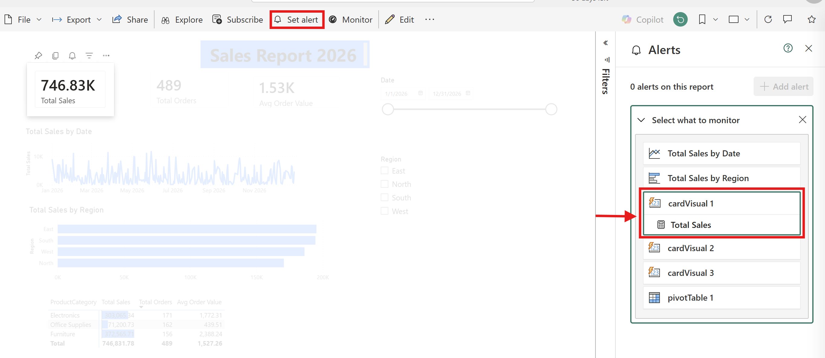
The data comes to you when something needs attention.
Mobile-Optimized Views
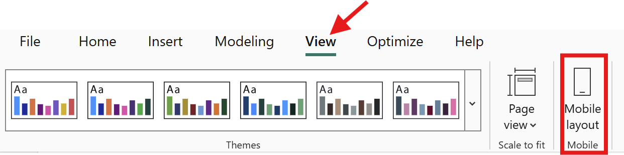
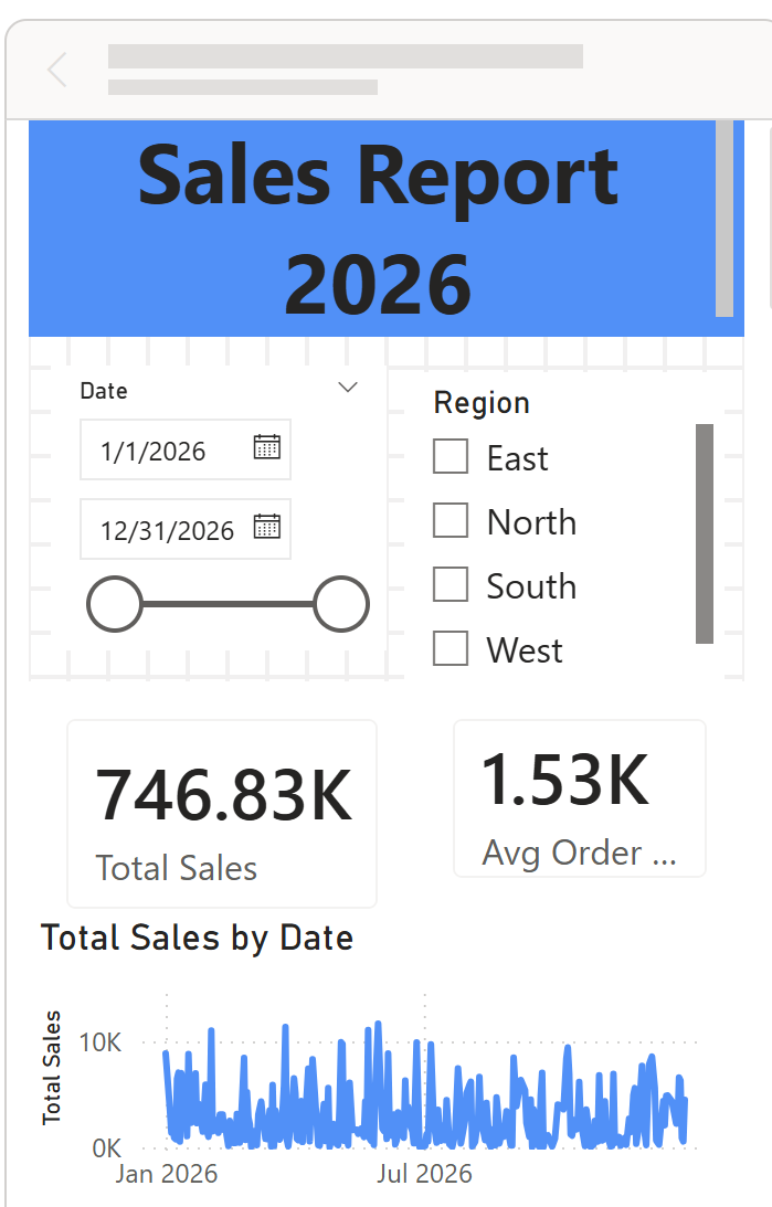
By default, Power BI renders your desktop report layout on mobile, which works but can feel cramped. You can design a layout specifically for phones.
In Power BI Desktop, go to View → Mobile Layout. A phone-shaped canvas appears. Drag visuals from your existing report onto this canvas and resize them for the smaller screen. Focus on the most important visuals, the KPI cards and one or two key charts. You don't need to fit everything on the phone layout.
This step is optional, but it significantly improves the experience for reports that people check regularly on their phones.
What to Learn Next
You've covered the full Power BI workflow: load, clean, model, visualize, publish, share, and access on mobile. That's a strong foundation. Here's where to go deeper.
DAX: The three measures you wrote (SUM, COUNTROWS, DIVIDE) are the beginning. Time intelligence (year-over-year comparisons), iterators (row-by-row calculations), and CALCULATE (the most powerful DAX function) open up much more. The Learn Data Modeling in Power BI course by Dataquest expands on these concepts with practical examples, helping you move from basic measures to more advanced analytical patterns.
Certification: The PL-300 Microsoft Power BI Data Analyst certification validates your skills and is a common requirement in job postings. Microsoft Learn provides a free study path.
Python and SQL: Power BI is a visualization and modeling layer. The data that feeds it often comes from databases (SQL) or requires preparation in Python. Dataquest's Data Analyst in Python path teaches you to prepare and analyze data with Python, and our SQL Fundamentals course covers querying databases, one of the most common Power BI data sources.
Learning Power BI well takes time — weeks for comfort, months for proficiency. That's normal. Every report you build makes the next one easier, and the skills compound faster than you'd expect.
FAQ
Is Power BI free?
Power BI Desktop is free to download and use, no license needed.
Power BI Service has a free tier for personal use (your own workspace, your own reports).
To share reports with others, you need Power BI Pro (\$14/user/month) or Premium Per User (\$24/user/month).
If your organization uses Microsoft 365 E5, Pro may already be included in your subscription.
Do I need to know SQL or Python to use Power BI?
No.
You can build effective reports using Power BI's built-in tools: Power Query for data transformation and DAX for calculations.
That said, SQL is valuable when your data lives in databases, and Python helps with advanced data preparation.
Both are worth learning over time, but neither is a prerequisite for this tutorial.
What's the difference between a calculated column and a measure?
A calculated column adds a new column to your table, it's computed row by row and stored.
You'd use it for values you want to filter or sort by (like our TotalSales column).
A measure calculates on the fly based on the current filter context, it recalculates every time someone interacts with a slicer or filter.
Use measures for aggregations like totals, averages, and counts.
How long does it take to learn Power BI?
This tutorial takes 2–3 hours.
Getting comfortable building reports from your own data takes a few weeks of regular practice.
Reaching proficiency with data modeling and intermediate DAX typically takes 3–6 months of building real projects.
The learning curve is manageable if you focus on building things rather than only reading about them.
Can I use Power BI on a Mac?
Power BI Desktop is Windows-only.
If you're on a Mac, you have a few options: use Power BI Service in your browser (it supports report viewing, sharing, and basic editing), run Windows through Parallels Desktop or a virtual machine, or use the Power BI Mobile App on your iPhone or iPad.
The browser experience covers most needs outside of advanced report building.
Want to read more?
Check out the full article on the original site